Meet Stefano Schiavon | Designer
We had the good fortune of connecting with Stefano Schiavon and we’ve shared our conversation below.
Hi Stefano, we’d love to hear more about how you thought about starting your own business?
In reality the Van Orton project was born in a very natural and casual way.
We have always had a passion for design and worked for many years in an advertising agency as traditional graphic designers.
One day 10 years ago, while we were still working in the advertising agency, also due to our passion for cult films of the 80s, we decided to pay homage to a film to which we are very attached (Back to the Future) and therefore we created the film poster in a style that was somewhat reminiscent of the stained glass windows of Gothic churches and the art of Roy Lichtenstein.
From there we started receiving requests for movie posters from the 80s and 90s.
For us it was a very great and beautiful stimulus
Let’s talk shop? Tell us more about your career, what can you share with our community?
We have always been very inspired by pop art, in particular by the artist Roy Lichtenstein, his style was really avant-garde for that era.
Coming to the present day there are some illustrator artists that we really love, for example Kilian Eng, or Laurent Durieux.
They are three different artists but each with a unique and very deep atmosphere.
The initial style of our work was very similar to the windows of the churches, thick black lines and bright colors, but over time we decided to experiment always starting from the same construction.
The black lines turned into luminous lines and the color geometries became neon shades.
In particular, there has been a work that represents at best the evolution
of our style, and it is Kubrick’s collection for a gallery in San Francisco.
We wanted to represent her obsession with the perspective point.
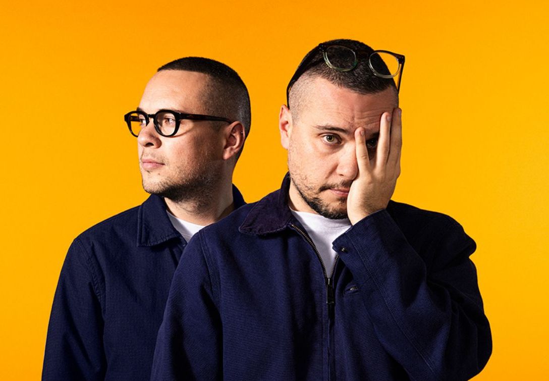
Initially we did not have a well-defined work process, in the sense that my brother and I did everything (from the preparation, to the initial outline of the design, to the final coloring).
Then with the passage of time, in a very natural way, we divided the tasks, initially we find the ideas together but then my brother Marco mainly follows the process of the traces of the design, with very thick and well defined black lines.
While I deal with all the color (with insertion of texture and pattern) and the final part of the work.
Fortunately we always agree and few times we have had contrasts.
The positive side of being twins is definitely that of being able to share the work and trust one another.
In addition, also that of giving oneself the strength on some decisions or choices that maybe alone is more difficult to take.
The downside is that when there is so much work we would like to have two more twins to share the work with.
Let’s say your best friend was visiting the area and you wanted to show them the best time ever. Where would you take them? Give us a little itinerary – say it was a week long trip, where would you eat, drink, visit, hang out, etc.
We are from Rivoli, a small town near Turin. I would certainly make him visit the Castello di Rivoli, which is currently a beautiful museum of contemporary art recognized throughout Europe, truly very fascinating.
Then I think I would make him visit the Turin cinema museum inside the Mole Antonealliana, precisely because of our great passion for cinema
Who else deserves some credit and recognition?
Craig and Karl
Website: https://vanortondesign.com/
Instagram: https://www.instagram.com/vanortondesign/
Twitter: https://twitter.com/vanortondesign
Facebook: https://www.facebook.com/vanortondesign


